General Interaction
The Main Window
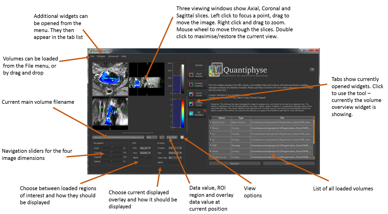
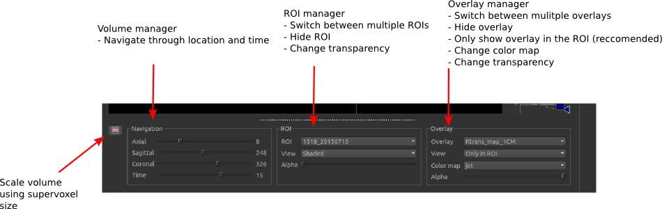
The Navigation Bar
Using Widgets
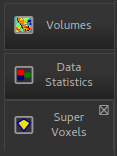
Widgets appear to the right of the viewer window. Most widgets are accessed from the ‘Widgets’ menu above the viewer.
When selected, a widget will appear with a tab to the right of the viewer. You can switch between opened widgets by clicking on the tabs. A widget opened from the menu can be closed by clicking on the X in the top right of its tab.
Widgets may have very different user interfaces depending on what they do, however there are a number of common elements:
Help button

This opens the online documentation page relevant to the widget. Internet access is required.
Options button

This shows any extended options the widget may have. It is typically used by widgets which display plots as that limits the space available for options.
Batch button

This displays the batch code required to perform the widget’s processing, using the currently selected options. This can be useful when building batch files from interactive exploration. It is only supported by widgets which provide image processing functions.
Citation

Many widgets are based around novel data processing techniques. The citation provides a reference to a published paper which can be used to find out more information about the underlying method. If you publish work using a widget with a citation, you should at the very least reference the paper given.
Clicking on the citation button performs an internet search for the paper.