Quantiphyse DSC Tutorial
Introduction
This example aims to provide an overview of Bayesian model-based analysis for Dynamic Susceptibility Contrast MRI.
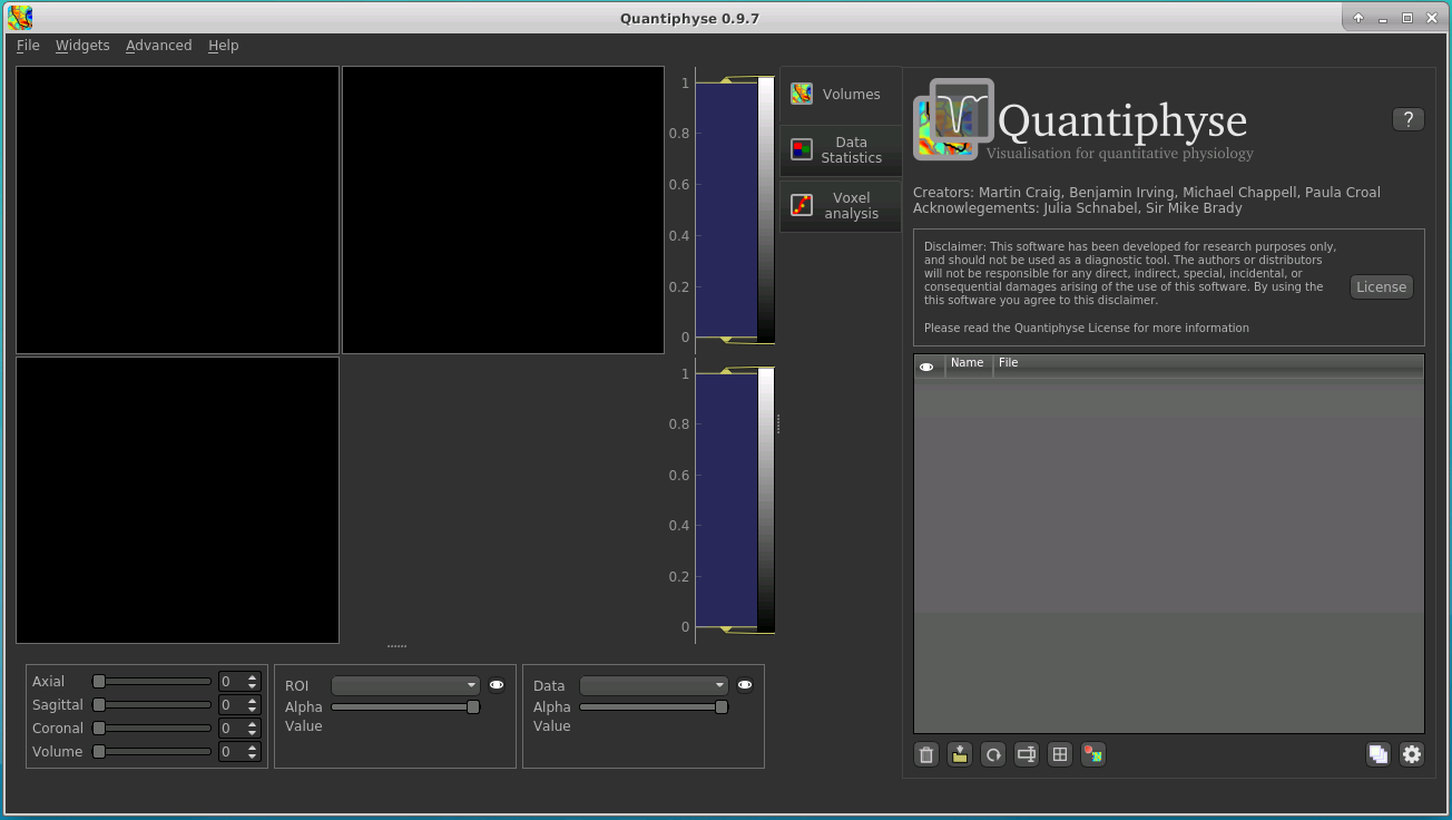
Basic Orientation
Before we do any data modelling, this is a quick orientation guide to Quantiphyse if you’ve not used it before. You can skip this section if you already know how the program works.
Start the program by typing quantiphyse at a command prompt, or clicking on the Quantiphyse
icon ![]() in the menu or dock.
in the menu or dock.
Loading the DSC Data
If you are taking part in an organized practical workshop, the data required may be available in your home
directory, in the course_data/dsc folder. If not, you will have been given instructions
on how to obtain the data from the course organizers.
We will start by loading the main DSC data file for the subject patient-03:
DSC.nii.gz
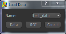
Files can be loaded in NIFTI format either by dragging and dropping in to the view pane, or by clicking
File -> Load Data. When loading a file you should indicate if it is data or an ROI by clicking the
appropriate button when the load dialog appears.
The data should appear in the viewing window.
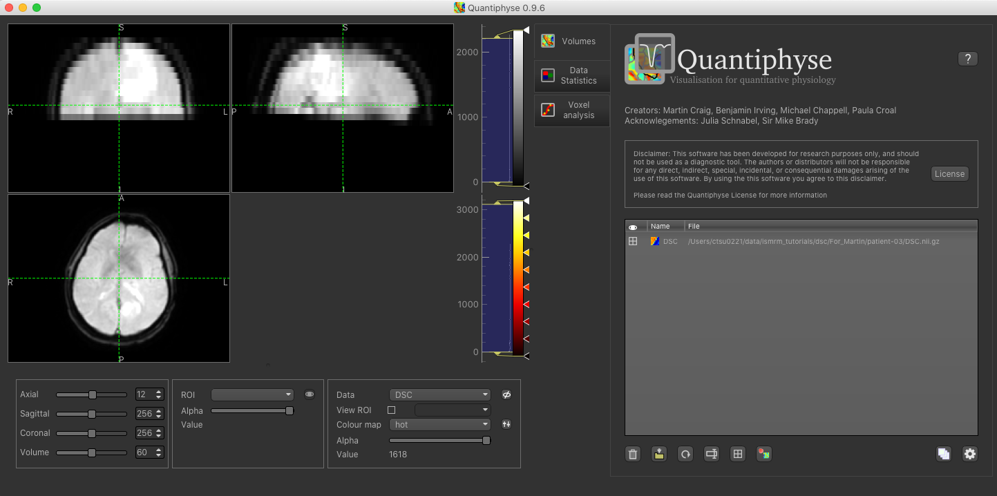
Image view
The left part of the window contains three orthogonal views of your data. If you double click on a slice view it will fill the viewer with that slice - double click again to return the the three slice view.
- Left mouse click to select a point of focus using the crosshairs
- Left mouse click and drag to pan the view
- Right mouse click and drag to zoom
- Mouse wheel to move through the slices
- Double click to ‘maximise’ a view, or to return to the triple view from the maximised view.
Widgets
The right hand side of the window contains ‘widgets’ - tools for analysing and processing data. Three are visible at startup:
Volumesprovides an overview of the data sets you have loadedData statisticsdisplays summary statistics for data setVoxel analysisdisplays timeseries and overlay data at the point of focus
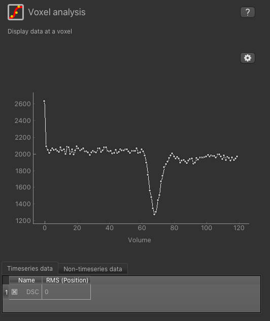
Select a widget by clicking on its tab, just to the right of the image viewer. If you click on the ‘Voxel Analysis’ widget and select a voxel you can see the DSC time series:
More widgets can be found in the Widgets menu at the top of the window. The tutorial
will tell you when you need to open a new widget.
For a slightly more detailed introduction, see the Getting Started section of the User Guide.
Pre-processing
Trimming
You can see from the timeseries that the signal was not in equilibrium for the first couple of
volumes, so we can trim these off to make the data easier to fit. From the Widgets menu select
Processing->Simple Maths and enter the following:
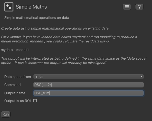
This will trim off the first two volumes and create a new data set named DSC_trim. If you know
Python and Numpy you will be able to see what is being done here - you can use any simple Numpy
expression here to do generic preprocessing on data sets.
Downsampling
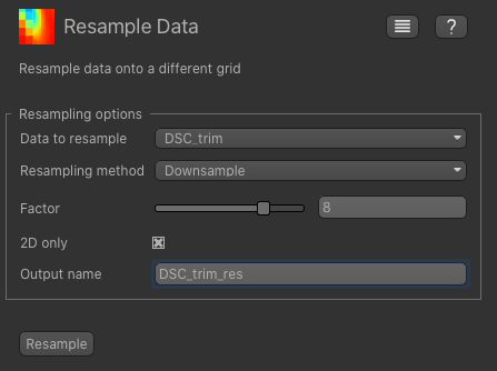
This DSC data is very high resolution because it has been pre-registered to a high-resolution structural image. As a result the modelling will be too slow to run for a tutorial setting. To solve this problem we will downsample the data by a factor of 8 in the XY plane which will enable the analysis to run in a reasonable time.
From the Widgets menu select Utilities->Resample and set the data set to our trimmed DSC data set.
Choose Downsample as the method and 8 as the factor, and name the output DSC_res. Make sure you
also click the 2d only option - otherwise it will reduce the Z resolution as well which we do not want.
This may take a few minutes to complete, so feel free to read on while you wait for it to finish.
Brain Extraction
We recommend brain extraction is performed as a preliminary step, and will do this using FSL’s BET tool.
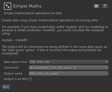
First we need to take the mean of the DSC timeseries so we have a 3D data set. To do this we can use the
Processing->Simple Maths widget again as follows:
Now, from the Widgets menu select FSL->BET and then as input data choose the mean of our trimmed
and resampled DSC data DSC_trim_res_mean. Check the Output brain mask option so we get a binary
ROI mask for the brain.
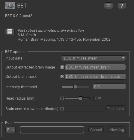
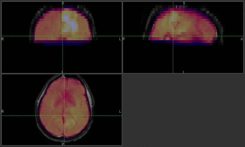
Click Run and an ROI should be generated covering the brain and displayed as follows:
When viewing the output of modelling, it may be clearer if the ROI is displayed as an outline rather than a shaded
region. To do this, click on the ![]() icon to the right of the ROI selector (below the image view):
icon to the right of the ROI selector (below the image view):
The icon cycles between display modes for the ROI: shaded (with variable transparency selected by the slider below), shaded and outlined, just outlined, or no display at all.
Note
If you accidentally load an ROI data set as Data, you can set it to be an ROI using the Volumes widget
(visible by default). Just click on the data set in the list and click the Toggle ROI button.
AIF
Analysis of DSC data requires the arterial input function to be specified. This is a timeseries that corresponds to
the supply of the bolus in a feeding artery. The AIF can be defined in various ways, in the case of this data set
we have already identified a feeding artery in the image and created a small ROI mask identifying it. To load this ROI,
load the file AIFx4.nii.gz either from File->Load or by drag and drop. Make sure you select ‘ROI’ as the data
set type.
You will probably not be able to see the ROI because it is only 3 very small voxels, but we can extract the DSC signal
in these voxels using the Utilities->AIF widget. Open this widget, set the trimmed (but not resampled) DSC data
as the input, and choose Use existing ROI as the option. Select AIFx3 as the ROI and the AIF should be displayed
below.
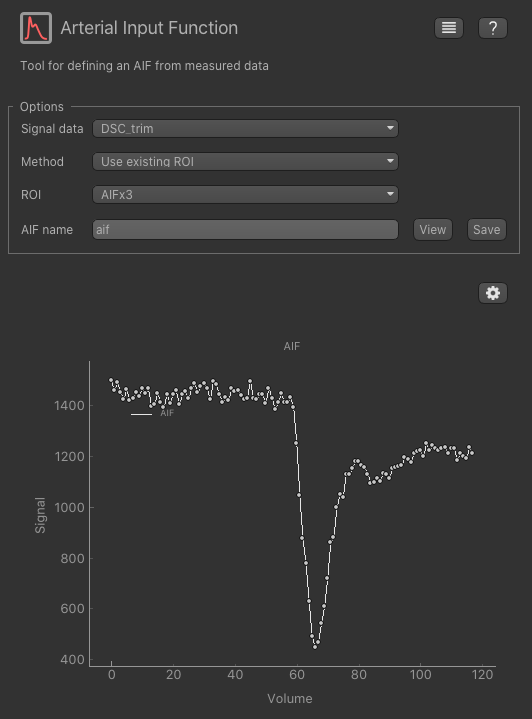
To get this AIF into the DSC widget click View which shows the sequence of numeric values. Click Copy to copy
these numbers which we will shortly use in the DSC widget itself.
Bayesian Analysis
To do DSC model analysis, select the DSC tool from the menu: Widgets -> DSC-MRI ->DSC. The widget
should look something like this:
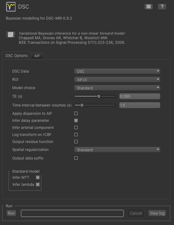
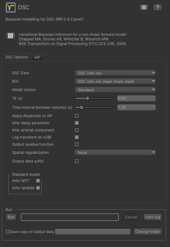
For the data select our trimmed and resampled DSC data: DSC_trim_res. For the ROI select the whole brain mask
DSC_trim_res_mean_brain_mask. The TE is 0.03s and the TR is 1.25s - you can find these values in the metadata file DSC.json.
We also recommend you set Log transform on rCBF as this prevents negative values in the CBF output. Also, for
this tutorial you should change Spatial regularization to None - this makes the analysis quicker to run and less
memory hungry. For production analysis however we would recommend using spatial regularization which causes parameter
maps to undergo adaptive smoothing during the inference process. Other options can be left at their default values:
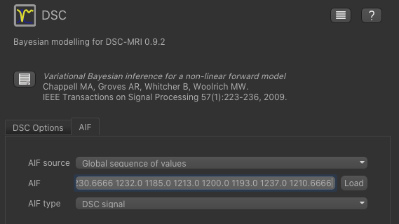
Now click on the AIF tab and paste the values we copied from the AIF widget into the AIF box (using right click
of the mouse or CTRL-V). Make sure the options are set to Global sequence of values and DSC signal.
Now we are ready to click Run - the analysis will take a few minutes so read on while you are waiting.
The output data will be loaded into Quantiphyse as the following data sets:
modelfit: Predicted signal timeseries for comparison with the actual dataMTT: Mean Transit Time predicted by the model, measured in secondssig0: Mean offset signal predicted by modellam: Shape parameter of the gamma distribution used to model the transit timesdelay: Time to peak of the deconvolved signal cure, measured in secondsrCBF: Relative Cerebral Blood Flow predicted by the model, measured in units of ml/100 g/min
Visualising Processed Data
If you re-select the Voxel analysis widget which we used at the start to look at the DSC signal in the
input data, you can see the model prediction overlaid onto the data. By clicking on different voxels you
can get an idea of how well the model has fitted your data.
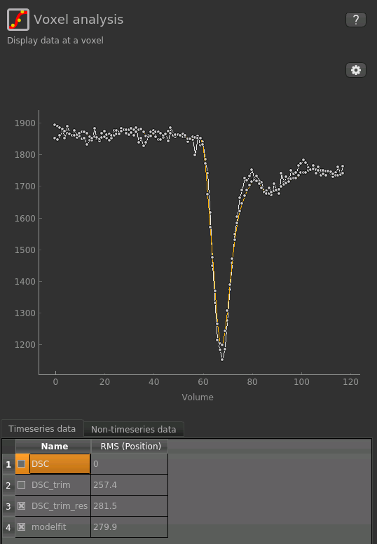
Note that for clarity we have turned off display of the un-trimmed and un-resampled DSC data, leaving just
our preprocessed data and model fit - you can do this by clicking the checkboxes under Timeseries data
at the bottom of the Voxel Analysis widget.
Parameter map values at the selected voxel are also displayed in Voxel Analysis by selecting the Non-timeseries data` tab.
The various parameter maps can be selected for viewing from the Volumes widget, or using the overlay selector below the image viewer. This is the rCBF output for this data:
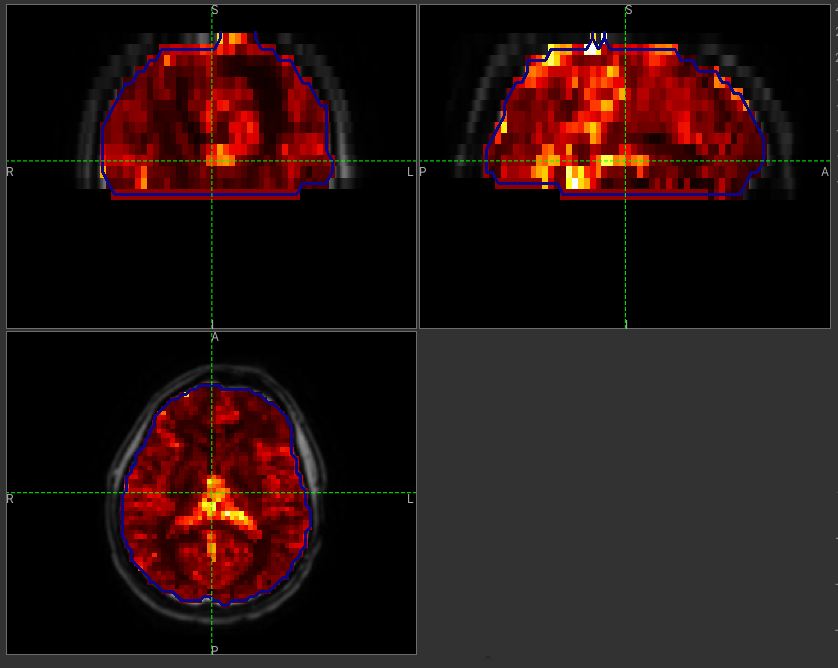
To make this map visualisation clearer we have set the colour map range to 0-0.5 by clicking on the ‘levels’  button
in the view options section, below the main viewer window. We have also selected the brain mask as the ‘View ROI’
which means that the map is only displayed inside this ROI, and set the ROI view mode to ‘outline’ as described previously.
button
in the view options section, below the main viewer window. We have also selected the brain mask as the ‘View ROI’
which means that the map is only displayed inside this ROI, and set the ROI view mode to ‘outline’ as described previously.
Quantitative Analysis
DSC-derived maps have different patterns in different pathologies. For instance, in the brain tumor disease, rCBF map tends to be hyperintense in tumor ROI compare to contralateral healthy tissue, and considered as an important biomarker for diagnosis. On the other hand, time parameters such as delay and MTT are of less significant in brain tumor disease, while these maps are critical in stroke disease.
To compare rCBF values in tumor ROI and Normal appearing white matter (NAWM) ROI, first you need to load
the ROIs MaskTumor.nii.gz and MaskNAWM.nii.gz using File->Load or by drag and drop.
Make sure you select ROI as the data set type.
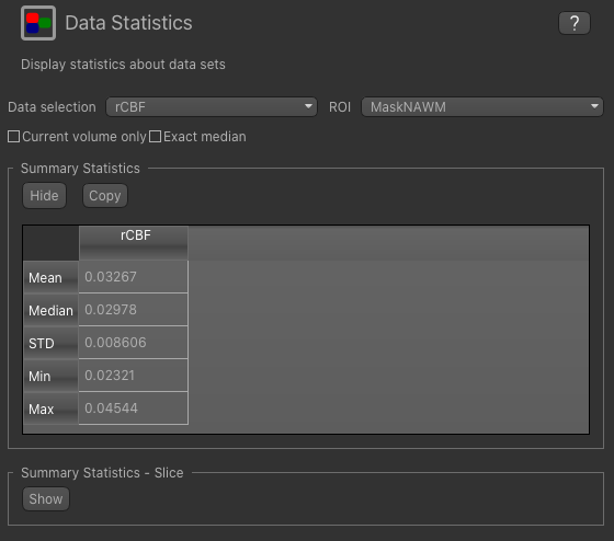
To view summary statistics, select the Data Statistics widget on the right hand side of the window. If you select
the rCBF map from the first menu, and the MaskTumor ROI from the second you can view the following statistics:

We can compare with the statistics in normal appearing white matter by changing the ROI to MaskNAWM:
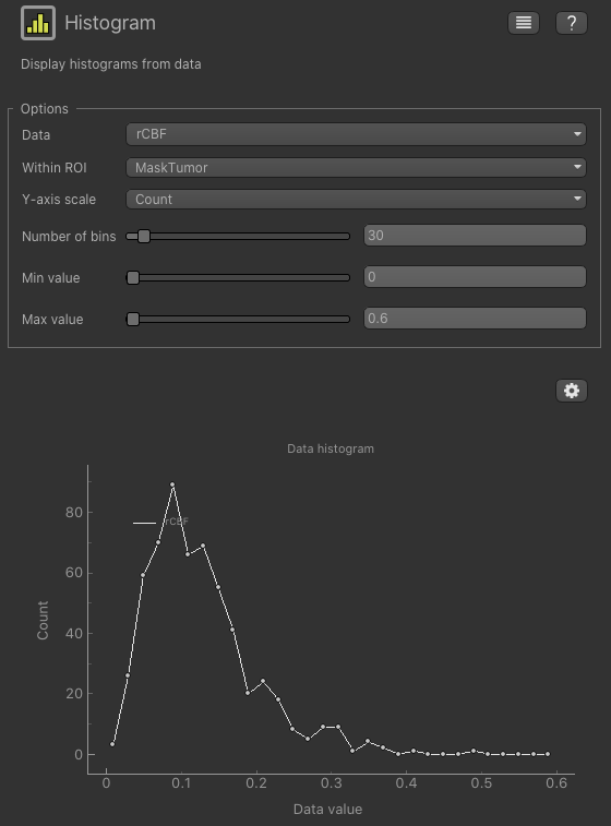
Another way of comparing rCBF in these healthy and pathological ROI is by looking at histogram pattern of this
map. From the Widgets menu select Visualisation->Histogram , then enter the following:
You can change Within ROI to MaskNAWM and see the historgram there
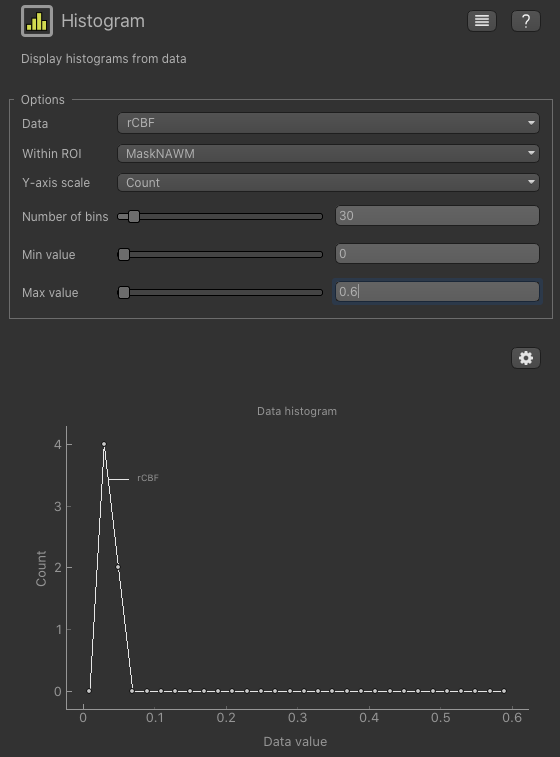
Note that the number of voxels in the NAWM mask is quite a bit lower than the number in the tumour mask (use
Widgets->ROIs->ROI analysis to see how many) and therefore the shape of the histogram is less informative.
References
| [1] | Mouridsen K, Friston K, Hjort N, Gyldensted L, Østergaard L, Kiebel S. Bayesian estimation of cerebral |
perfusion using a physiological model of microvasculature. NeuroImage 2006;33:570–579. doi: 10.1016/j.neuroimage.2006.06.015
| [2] | Chappell, M.A., Mehndiratta, A., Calamante F., “Correcting for large vessel contamination in DSC perfusion |
MRI by extension to a physiological model of the vasculature”, e-print ahead of publication. doi: 10.1002/mrm.25390