Arterial Spin Labelling Tutorial
In this practical you will learn how to use the BASIL tools in FSL to analyse ASL data, specifically to obtain quantitative images of perfusion (in units of ml/100 g/min), as well as other haemodynamic parameters.
This tutorial describes the analysis using Quantiphyse - the same analysis can be performed using the command line tool or the FSL GUI. The main advantage of using Quantiphyse is that you can see your input and output data and take advantage of any of the other processing and analysis tools available within the application.
We will mention some of this additional functionality in Quantiphyse as we go, but do not be afraid to experiment with any of the built-in tools while you are following the tutorial.
This practical is based on the FSL course practical session on ASL. The practical is a shorter version of the examples that accompany the Primer: Introduction to Neuroimaging using Arterial Spin Labelling. On the website for the primer you can find more examples.
http://www.neuroimagingprimers.org/examples/introduction-primer-example-boxes/
Contents
Basic Orientation
Before we do any data modelling, this is a quick orientation guide to Quantiphyse if you’ve not used it before. You can skip this section if you already know how the program works.
Start the program by typing quantiphyse at a command prompt, or clicking on the Quantiphyse
icon ![]() in the menu or dock.
in the menu or dock.
Loading some data
If you are taking part in an organized practical, the data required will be available in your home
directory, in the course_data/ASL folder. If not, the data can be can be downloaded from the FSL course site:
https://fsl.fmrib.ox.ac.uk/fslcourse/downloads/asl.tar.gz
Start by loading the ASL data into Quantiphyse - use File->Load Data or drag and drop to load
the file spld_asltc.nii.gz. In the Load Data dialog select Data.
The data should look as follows:
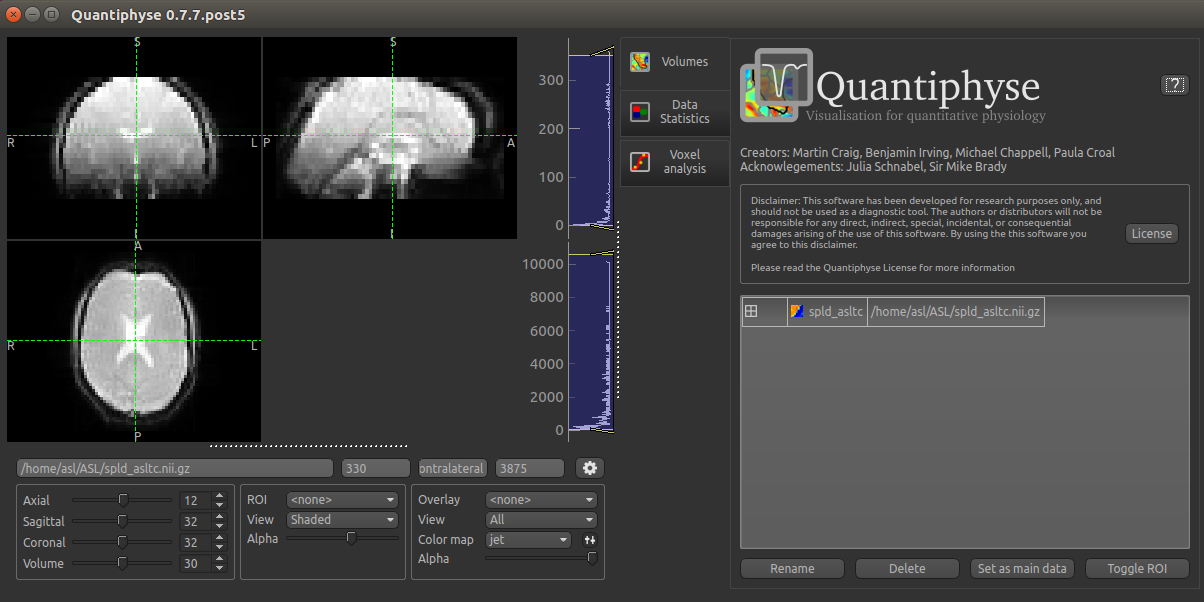
Image view
The left part of the window contains three orthogonal views of your data.
- Left mouse click to select a point of focus using the crosshairs
- Left mouse click and drag to pan the view
- Right mouse click and drag to zoom
- Mouse wheel to move through the slices
- Double click to ‘maximise’ a view, or to return to the triple view from the maximised view.
Widgets
The right hand side of the window contains ‘widgets’ - tools for analysing and processing data. Three are visible at startup:
Volumesprovides an overview of the data sets you have loadedData statisticsdisplays summary statistics for data setVoxel analysisdisplays timeseries and overlay data at the point of focus
Select a widget by clicking on its tab, just to the right of the image viewer.
More widgets can be found in the Widgets menu at the top of the window. The tutorial
will tell you when you need to open a new widget.
For a slightly more detailed introduction, see the Getting Started section of the User Guide.
Perfusion quantification using Single PLD pcASL
In this section we will generate a perfusion image using the simplest analysis possible on the simplest ASL data possible.
Click on the Voxel Analysis widget - it is visible by default to the right of the main image view,
then click on part of the cortex. You should see something similar to this:
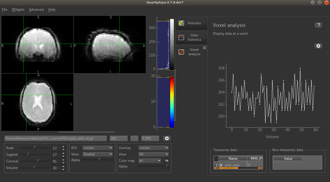
You can see that the data has a zig-zag low-high pattern - this reflects the label-control repeats in the data. Because the data was all obtained at a single PLD the signal is otherwise fairly constant.
A perfusion weighted image
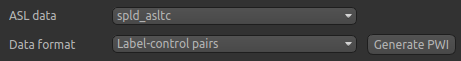
Open the Widgets->ASL->ASL Data Processing widget. We do not need to set all the details of the
data set yet, however note that the data format is (correctly) set as Label-control pairs.
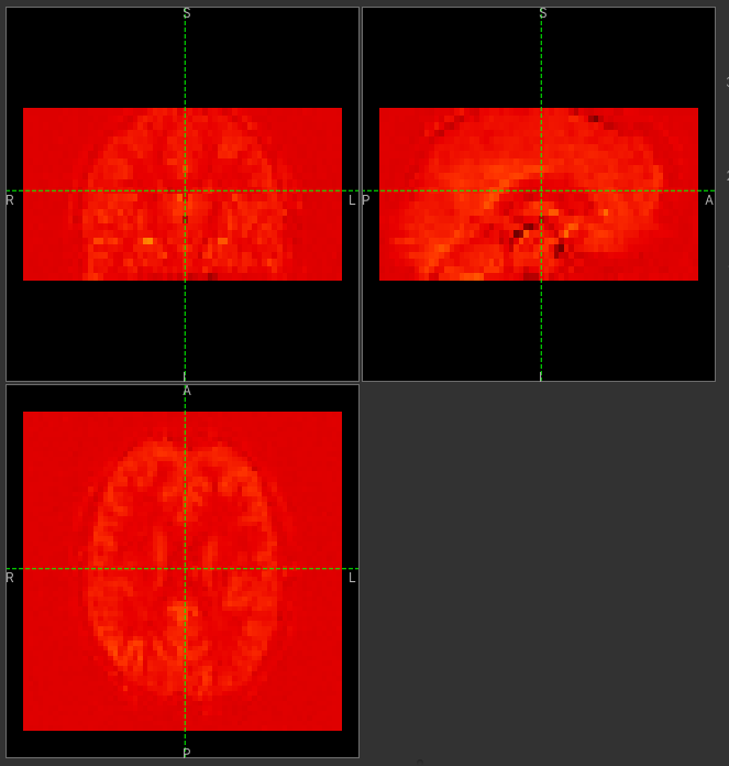
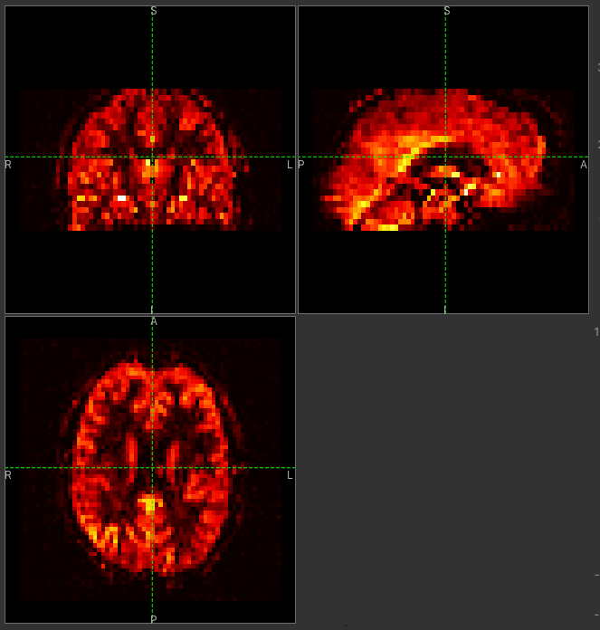
Click on the Generate PWI button. This performs label-control subtraction and averages the
result over all repeats. The result is displayed as a colour overlay, which should look like a
perfusion image:
We can improve the display a little by adjusting the colour map. Find the overlay view options below the main image view:
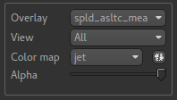
Next to the Color Map option (which you can change if you like!) there is a levels button  which lets you change the min and max values of the colour map. Set the range from
 0 to 10
and select Values outside range to Clamped.
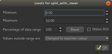
Then click Ok. The perfusion weighted image should now be clearer:
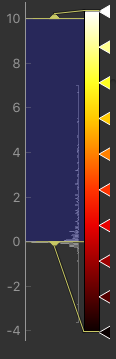
You could also have modified the colour map limits by dragging the colourmap range widget directly - this is located to the right of the image view. You can drag the upper and lower limits with the left button, while dragging with the right button changes the displayed scale. You can also customize the colour map by clicking on the colour bar with the right button.
Warning
Dragging the colourmap is a little fiddly due to a GUI bug. Before trying to adjust the levels, drag down with the right mouse button briefly on the colour bar. This unlocks the automatic Y-axis and will make it easier to drag on the handles to adjust the colour map.
Colour map widget
Model based analysis
This dataset used pcASL labeling and we are going to start with an analysis which follows as closely as possible the recommendations of the ASL Consensus Paper [1] (commonly called the ‘White Paper’) on a good general purpose ASL acquisition, although we have chosen to use a 2D multi-slice readout rather than a full-volume 3D readout.
Looking at the ASL data processing widget we used to generate the PWI, you can see that this
is a multi-page widget in which each tab describes a different aspect of the analysis pipeline.
We start by reviewing the information on the first page which describes our ASL data acquisition:
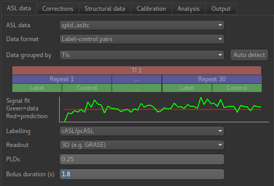
Most of this is already correct - we have label-control pairs and the data grouping does not
matter for single PLD data (we will describe this part of the widget later in the multi-PLD
analysis). The labelling method is correctly set as cASL/pcASL. However
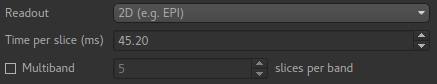
we have a 2D readout with 45.2ms between slices, so we need to change the Readout option
to reflect this. When we select a 2D readout, the option to enter the slice time appears
automatically.
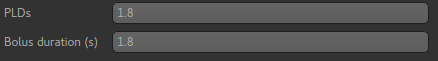
The bolus duration of 1.8s is correct, however we have used a post-labelling delay of 1.8s
in this data, so enter 1.8 in the PLDs entry box.
(Simple) Perfusion Quantification
In this section we invert the kinetics of the ASL label delivery to fit a perfusion image, and use the calibration image to get perfusion values in the units of ml/100g/min.
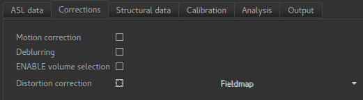
Firstly, on the Corrections tab, we will uncheck Motion Correction which is enabled by
default:
For this run we will skip the Structural data tab, and instead move on to Calibration.
To use calibration we first need to load the calibration image data file from the same folder containing the ASL
data - again we can use drag/drop or the File->Load Data menu option to load the following file:
aslcalib.nii.gz- Calibration (M0) image
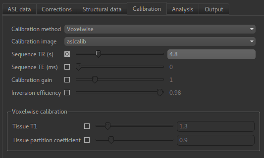
On the Calibration tab we set the calibration method as Voxelwise which is recommended
in the white paper. We also need to select the calibration image we have just loaded: aslcalib.
The TR for this image was 4.8s, so click on the Sequence TR checkbox
and set the value to 4.8. Other values can remain at their defaults.
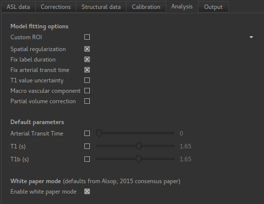
On the Analysis we select Enable white paper mode at the bottom which sets some default
values to those recommended in the White paper.
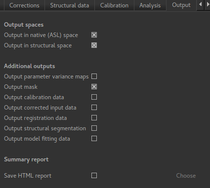
We will not change the defaults on the Output tab yet, but feel free to view the options
available.
We are now set up to run the analysis - but before you do, check the green box at the bottom of
the widget which reports where it thinks FSL is to be found. If the information does not seem
to be correct, click the Change button and select the correct location of your FSL
installation.
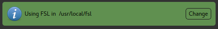
Finally click Run at the bottom to run the analysis. You can click the View Log button
to view the progress of the analysis which should only take a few minutes.
Note
While you are waiting you can read ahead and even start changing the options in the GUI ready for the next analysis that we want to run.
Once the analysis had completed, some new data items will be available. You can display them either
by selecting them from the Overlay menu below the image display, or by clicking on the
Volumes widget and selecting them from the list. The new data items are:
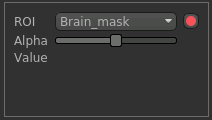
perfusion_native- Raw (uncalibrated) perfusion mapperfusion_calib_native- Calibrated perfusion data in ml/100g/minmask_native- An ROI (which appears in the ROI selector under the image view) which represents the region in which the analysis was performed.
When viewing the output of modelling, it may be clearer if the ROI is displayed as an outline rather than a shaded
region. To do this, click on the icon ![]() to the right of the ROI selector (below the image view):
to the right of the ROI selector (below the image view):
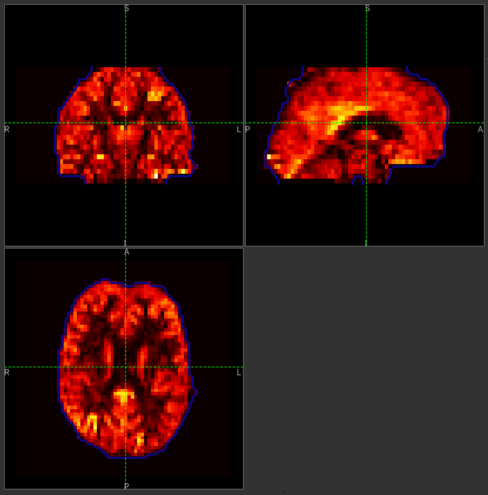
The perfusion_calib_native image should look similar to the perfusion weighted image we created
initially, however the data range reflects the fact that it is in physical units in which average GM
perfusion is usually in the 30-50 range. To get a clear visualisation set the color map range to 0-150
using the Levels button as before. You can also select Only in ROI as the View option
just above this so we only see the perfusion map within the selected ROI. The result should look
something like this:
Improving the Perfusion Images from single PLD pcASL
The purpose of this practical is essentially to do a better job of the analysis we did above, exploring more of the features of the GUI including things like motion and distortion correction.
Motion and Distortion correction
First we need to load an additional data file:
aslcalib_PA.nii.gz- this is a ‘blipped’ calibration image - identical toaslcalibapart from the use of posterior-anterior phase encoding (anterior-posterior was used in the rest of the ASL data). This is provided for distortion correction.
Go back to the GUI which should still be setup from the last analysis you did.
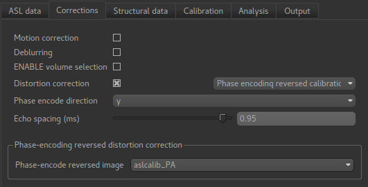
On the Corrections tab, we will check Motion Correction to enable it, and
and click on the Distortion Correction checkbox to show distortion correction options.
We select the distortion correction method as Phase-encoding reversed calibration, select
y as the phase encoding direction, and 0.95 as the echo spacing in ms (also known as the
dwell time). Finally we need to select the phase-encode reversed image as aslcalib_PA which
we have just loaded:
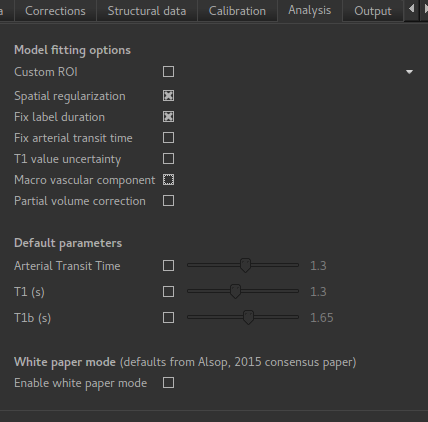
On the Analysis tab, make sure you have Spatial regularization selected
(it is by default). This will reduce the appearance of noise in the final perfusion image using
the minimum amount of smoothing appropriate for the data.
In order to compare with the previous analysis we might want the output to have a different name.
To do this, on the Output tab, select the Prefix for output data names checkbox and
provide a short prefix in the text box, e.g. new_.
Note
As an alternative to using a prefix, you can also rename data items from the Volumes widget which is
visible by default. Click on a data set name in the list and click Rename to give
it a new name.
Now click Run again.
For this analysis we are still in ‘White Paper’ mode. Specifically this means we are using the simplest kinetic model, which assumes that all delivered blood-water has the same T1 as that of the blood and that the Arterial Transit Time should be treated as 0 seconds.
As before, the analysis should only take a few minutes, slightly longer this time due to the distortion and motion correction. Like the last exercise you might want to skip ahead and start setting up the next analysis.
The output will not be very different, but if you switch between the old and new
versions of the perfusion_calib_native data set you should be able to see slight stretching in
the anterior portion of the brain which is the outcome of distortion correction.
To do this
select the Volumes widget and in the data list click on the left hand box next to the data
item you want to see. An ‘eye’ icon will appear here  indicating that this data set is
now visible. Switch between
indicating that this data set is
now visible. Switch between new_perfusion_calib_native and perfusion_calib_native to
see the different - it helps if you set the colour map range the same for both data sets.
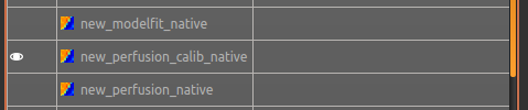
This data does not have a lot of motion in it so the motion correction is difficult to identify.
Making use of Structural Images
Thus far, all of the analyses have relied purely on the ASL data alone. However, often you will
have a (higher resolution) structural image in the same subject and would like to use this as well,
at the very least as part of the process to transform the perfusion images into some template space.
We can provide this information on the Structural Data tab.
You can either load
a structural (T1 weighted) image into Quantiphyse and select Structural Image as the
source of structural data, or if you have already processed your structural data with FSL_ANAT
you can point the analysis at the output directory. We will use the second method as it enables
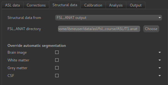
the analysis to run faster. On the Structural Data tab, we select FSL_ANAT output and chooses
the location of the FSL_ANAT output directory (T1.anat):
Note
If a simple structural image was provided instead of an FSL_ANAT output folder,
the FAST segmentation tool is automatically run to obtain partial volume estimates.
This adds considerably to the run-time so it’s generally recommended to run FSL_ANAT
separately first.
If we want to output our data in structural space (so it can be easily overlaid onto the structural
image), click on the Output tab and check the option Output in structural space:
This analysis will take somewhat longer overall (potentially 15-20 mins), the extra time is taken up doing careful registration between ASL and structural images. Thus, this is a good point to keep reading on and leave the analysis running.
You will find some new data sets in the overlay list, in particular:
perfusion_calib_struc- Calibrated perfusion in structural space
This is the calibrated perfusion image in high-resolution structural space. It is nice to view
it in conjunction with the structural image itself. To do this, load the T1.anat/T1.nii.gz
data file and select Set as main data when loading it. Then select perfusion_calib_struc
from the Overlay menu and select View as Only in ROI:
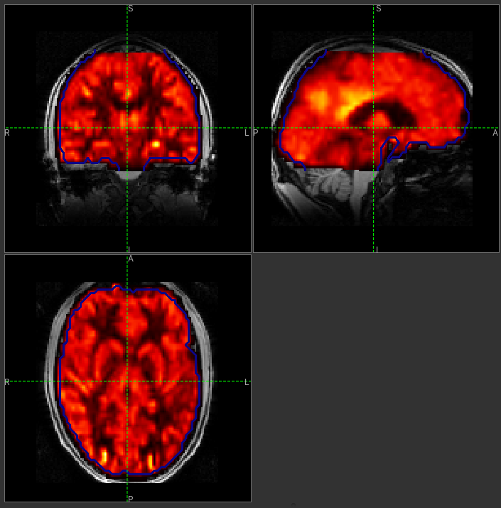
You can move the Alpha slider under the overlay selector to make the perfusion map more or less
transparent and verify that the perfusion map lines up with the structural data.
Different model and calibration choices
So far to get perfusion in units of ml/100g/min we have used a voxelwise division of the relative perfusion image by the (suitably corrected) calibration image - so called ‘voxelwise’ calibration. This is in keeping with the recommendations of the ASL White Paper for a simple to implement quantitative analysis. However, we could also choose to use a reference tissue to derive a single value for the equilibrium magnetization of arterial blood and use that in the calibration process instead - the so-called ‘reference region’ method.
Go back to the analysis you have already set up. We are now going to turn off ‘White Paper’ mode, this will provide us with more options to get a potentially more accurate analysis. To do this return to the ‘Analysis’ tab and deselect the ‘White Paper’ option. You will see that the ‘Arterial Transit Time’ goes from 0 seconds to 1.3 seconds (the default value for pcASL in BASIL based on our experience with pcASL labeling plane placement) and the ‘T1’ value (for tissue) is different to ‘T1b’ (for arterial blood), since the Standard (aka Buxton) model for ASL kinetics considers labeled blood both in the vasculature and the tissue.
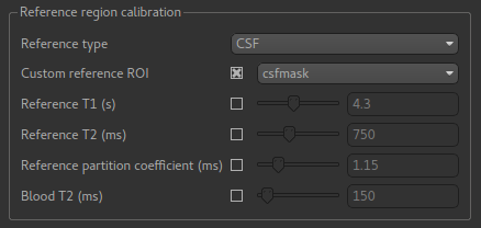
Now that we are not in ‘White Paper’ mode we can also change the calibration method. On the
Calibration tab, change the Calibration method to Reference Region.
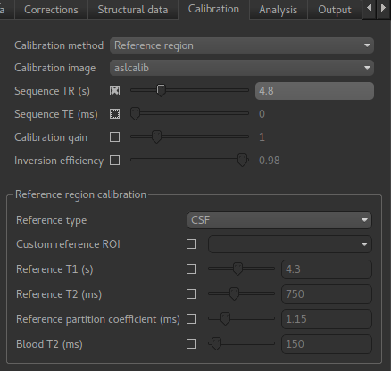
The default values will automatically identify CSF in the brain ventricles and use it to derive
a single calibration M0 value with which to scale the perfusion data. However this is quite
time consuming, so we will save ourselves the bother and provide a ready-made mask which identifies
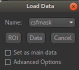
pure CSF voxels. To do this, first load the dataset csfmask.nii.gz and be sure to identify
it as an ROI (not Data).
Note
If you incorrectly load an ROI as a data set you can switch it to an ROI on the
Volumes widget which is visible by default. Select the data from the list and
click Toggle ROI.
Then select Custom reference ROI and choose csfmask from the list:
As before you may want to add an output name prefix so you can compare the results. Then click
Run once more.
The resulting perfusion images should look very similar to those produced using the voxelwise calibration, and the absolute values should be similar too. For this, and many datasets, the two methods are broadly equivalent.
Partial Volume Correction
Having dealt with structural image, and in the process obtained partial volume estimates, we are now in a position to do partial volume correction. This does more than simply attempt to estimate the mean perfusion within the grey matter, but attempts to derive and image of gray matter perfusion directly (along with a separate image for white matter).
This is very simple to do. First ensure that you have provided structural data (i.e. the FSL_ANAT output)
on the Structure tab. The partial volume estimates produced by fsl_anat (in fact they are done using
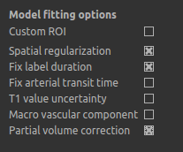
fast) are needed for the correction. On the Analysis tab, select Partial Volume Correction.
To run the analysis you would simply click Run again, however this will take a lot longer to run.
If you’d prefer not to wait, you can find the results of this analysis already completed in the
directory ASL/oxasl_spld_pvout.
In this results directory you will still find an analysis performed without partial volume correction
in native_space as before. The results of partial volume correction can be found in native_space/pvcorr.
In this directory the output perfusion data perfusion_calib.nii.gz is now an estimate of perfusion
only in gray matter. It has been joined by a new set of images for
the estimation of white matter perfusion, e.g., perfusion_wm_calib.nii.gz.
It may be more helpful to look at perfusion_calib_masked.nii.gz (and the equivalent
perfusion_wm_calib_masked.nii.gz) since this has been masked to include only voxels
with more than 10% gray matter (or white matter), i.e., voxels in which it is reasonable
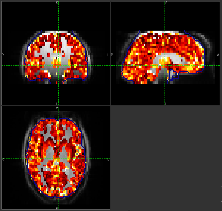
to interpret the gray matter (white matter) perfusion values - shown below.
GM perfusion (masked to include only voxels with >= 10% GM)
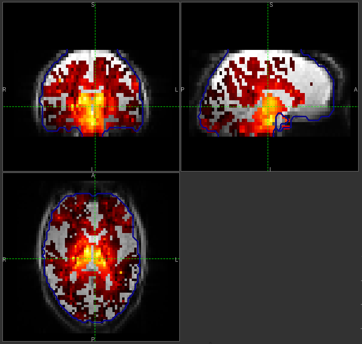
WM perfusion (masked to include only voxels with >= 10% WM)
Perfusion Quantification (and more) using Multi-PLD pcASL
The purpose of this exercise is to look at some multi-PLD pcASL. As with the single PLD data we can obtain perfusion images, but now we can account for any differences in the arrival of labeled blood-water (the arterial transit time, ATT) in different parts of the brain. As we will also see we can extract other interesting parameters, such as the ATT in its own right, as well as arterial blood volumes.
The data
Note
If you have accumulated a lot of data sets you might want to choose File->Clear all data
from the menu and start from scratch again. Note that you will need to re-load the calibration
and other input data. You can also delete data sets from the Volumes widget.
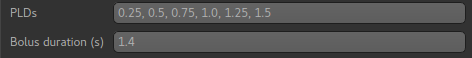
The data we will use in this section supplements the single PLD pcASL data above, adding multi-PLD ASL in the same subject (collected in the same session). This dataset used the same pcASL labelling, but with a label duration of 1.4 seconds and 6 post-labelling delays of 0.25, 0.5, 0.75, 1.0, 1.25 and 1.5 seconds.
The ASL data file you will need to load is:
mpld_asltc.nii.gz
The label-control ASL series containing 96 volumes. Each PLD was repeated 8 times, thus there are 16 volumes (label and control paired) for each PLD. The data has been re-ordered from the way it was acquired, such that all of the measurements from each PLD have been grouped together - it is important to know this data ordering when doing the analysis.
Perfusion Quantification
Going back to the ASL data processing widget, we first go back to the Asl Data tab page and select our new ASL data from the choice at the top:

We need to enter the 6 PLDs in the PLDs entry box - these can be separated by spaces or
commas. We also change the label duration to 1.4s:
As we noted earlier, in this data all of the measurements at the same PLD are grouped together.
This is indicated by the Data grouped by option which defaults (correctly in this case) to
TIs/PLDs. Below this selection there is a graphical illustration of the structure of the data
set:
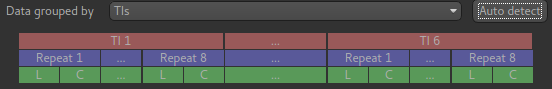
The data set volumes go from left to right. Starting with the top line (red) we see that the data set consists of 6 TIs/PLDs, and within each PLD are 8 repeats (blue), and within each repeat there is a label and a control image.
Below the grouping diagram, there is a visual preview of how well the actual data signal matches what would be expected from this grouping. The actual data signal is shown in green, the expected signal from the grouping is in red, and here they match nicely, showing that we have chosen the correct grouping option.
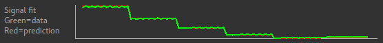
If we change the Data Grouped by option to Repeats (incorrect) we see that the actual
and expected signal do not match up:
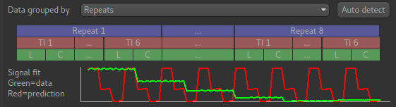
We can get back to the correct selection by clicking Auto detect which chooses the grouping
which gives the best match to the signal.
Another way to determine the data ordering is to open the Widget->Analysis->Voxel Analysis
widget and select a GM voxel, which should clearly shows 6 groups of PLDs (rather than 8 groups
of repeats):
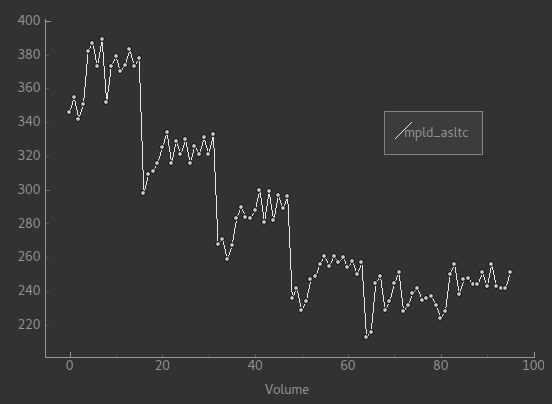
Each of the six roughly horizontal section of the signal represents the repeats at a given PLD and again the zig-zag pattern of the label-control images within each PLD are visible.
The remaining options are the same as for the single-PLD example:
- Labelling -
cASL/pcASL- Readout -
2D multi-slicewithTime per sliceof 45.2ms
We can use the same structural and calibration data as for the previous example because they are the same subject. The analysis pipeline will correct for any misalignment between the calibration image and the ASL data. We can also keep the distortion correction setup from before.
This analysis shouldn’t take a lot longer than the equivalent single PLD analysis, but feel free to skip ahead to the next section whilst you are waiting.
The results from this analysis should look similar to that obtained for the single
PLD pcASL. That is reassuring as it is the same subject. The main difference is the
a data set named arrival. If you examine this image you should find a pattern of
values that tells you the time it takes for blood to transit between the labeling and
imaging regions. You might notice that the arrival image was present even in the
single-PLD results, but if you looked at it contained a single value - the one set
in the Analysis tab - which meant that it appeared blank in that case.
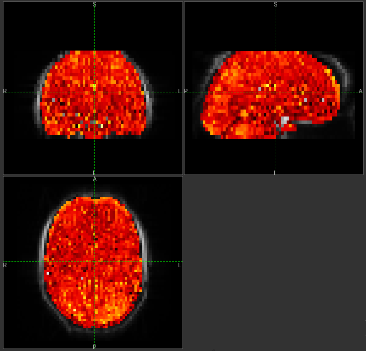
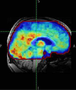
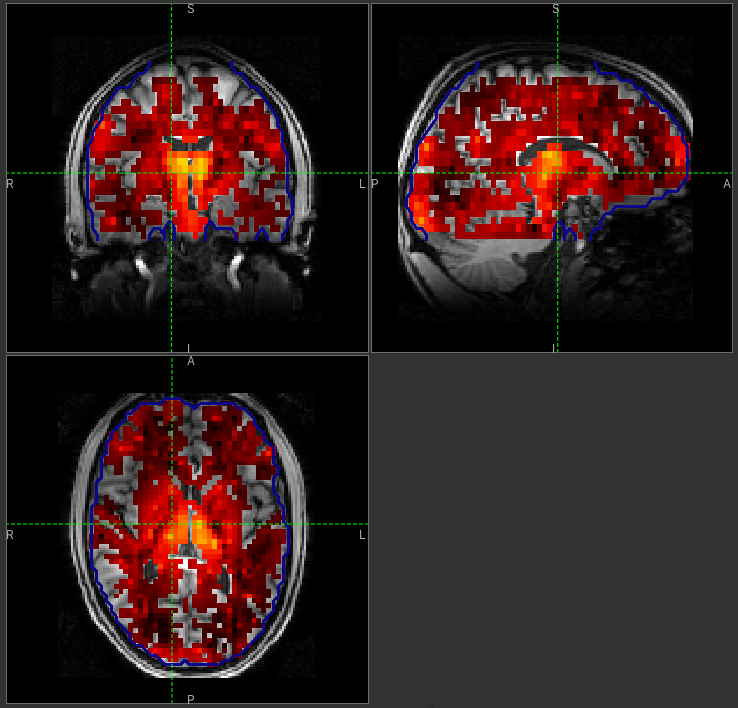
Arrival time of the labelled blood showing delayed arrival to the posterior regions of the brain.
Arterial/Macrovascular Signal Correction
In the analysis above we didn’t attempt to model the presence of arterial (macrovascular) signal. This is fairly reasonable for pcASL in general, since we can only start sampling some time after the first arrival of labeled blood-water in the imaging region. However, given we are using shorter PLD in our multi-PLD sampling to improve the SNR there is a much greater likelihood of arterial signal being present. Thus, we might like to repeat the analysis with this component included in the model.
Return to your analysis from before. On the Analysis tab select Macro vascular component.
Click Run again.
The results should be almost identical to the previous run, but now we also gain some
new data: aCBV_native and aCBV_calib_native.
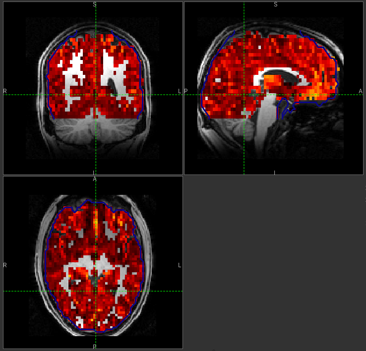
Following the convention for the perfusion images, these are the relative and absolute arterial (cerebral) blood volumes respectively. If you examine one of these and focus on the more inferior slices you should see a pattern of higher values that map out the structure of the major arterial vasculature, including the Circle of Willis. A colour map range of 0-100 helps with this, as well as clamping the colour map for out of range data:
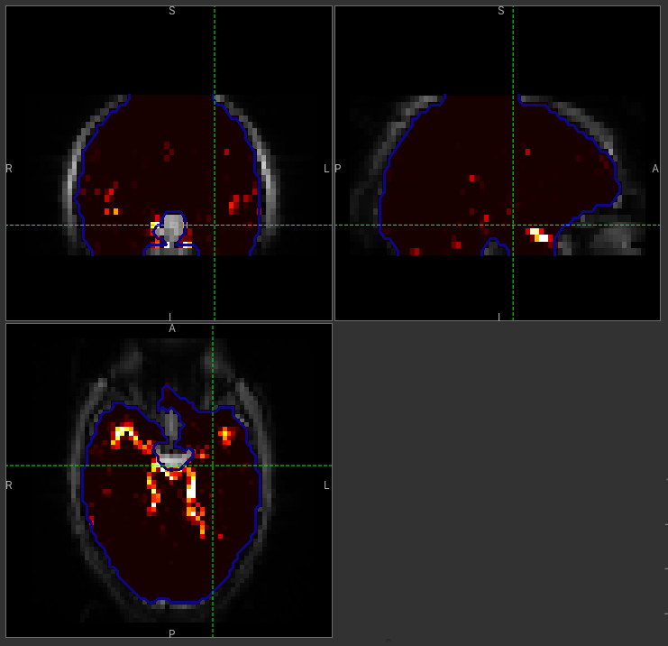
This finding of an arterial contribution in some voxels results in a correction to the perfusion image - you may now be able to spot that in the same slices where there was some evidence for arterial contamination of the perfusion image before that has now been removed.
Partial Volume Correction
In the same way that we could do partial volume correction for single PLD pcASL, we can do this for multi-PLD. If anything partial volume correction should be even better for multi-PLD ASL, as there is more information in the data to separate grey and white matter perfusion.
Just like the single PLD case we will require structural information, entered on the Structure
tab. On the Analysis tab, select Partial Volume Correction.
Again, this analysis will not be very quick and so you might not wish to click Run right now.
You will find the results of this analysis already completed for you in the directory
~/course_data/ASL/oxasl_mpld_pvout. This results directory contains, as a further subdirectory,
pvcorr, within the native_space subdirectory, the partial volume corrected results: gray matter
(perfusion_calib.nii.gz etc) and white matter perfusion (perfusion_wm_calib.nii.gz etc) maps.
GM perfusion (masked to include only voxels with >= 10% GM)
WM perfusion (masked to include only voxels with >= 10% WM)
Alongside these there are also gray and white matter ATT maps (arrival and arrival_wm respectively).
The estimated maps for the arterial component (aCBV_calib.nii.gz etc) are still present in the
pvcorr directory. Since this is not tissue specific there are not separate gray and white matter
versions of this parameter.
Additional useful options
A full description of the options available in the ASL processing widget are given in the reference documentation, however, here are a few in particular that you may wish to make use of:
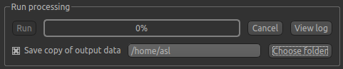
Save copy of output data
You can of course save the output data from your analysis using File->Save Current Data
however it’s often useful to have all the output saved automatically for you. By clicking
on this option (underneath the Run button) and choosing an output folder, this will
be done.
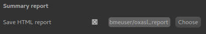
Generate HTML report
This option is available on the Output tab and will generate a summary report of the
whole pipeline in the directory that you specify. To get this you will need to select
the checkbox and enter or choose a directory to store the report in.
Quantiphyse will attempt to open the report in your default web browser when the pipeline
has completed, but if this does not happen you can navigate to the directory yourself and
open the index.html file.
Below is an example of the information included in the report:
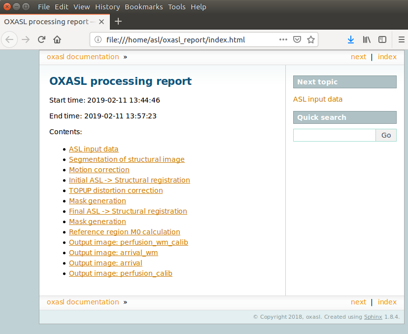
The links are arranged in the order of the processing steps and each link leads to a page giving more detail on this part of the pipeline. For example here’s it’s summary of the motion correction step for the single-PLD data:
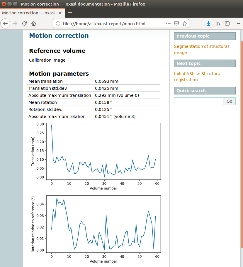
This shows that there’s not much motion generally and no particularly bad volumes.
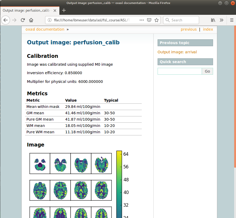
If we click on the perfusion image link we get a sample image and some averages in GM and WM. This is useful to check that the analysis seems to have worked and the numbers are in the right range:
References
| [1] | Alsop, D. C., Detre, J. A., Golay, X. , Günther, M. , Hendrikse, J. , Hernandez‐Garcia, L. , Lu, H. , MacIntosh, B. J., Parkes, L. M., Smits, M. , Osch, M. J., Wang, D. J., Wong, E. C. and Zaharchuk, G. (2015), Recommended implementation of arterial spin‐labeled perfusion MRI for clinical applications: A consensus of the ISMRM perfusion study group and the European consortium for ASL in dementia. Magn. Reson. Med., 73: 102-116. doi:10.1002/mrm.25197 |