Voxel analysis
This widget shows data at the selected voxel and is visible by default.
The upper part of the widget shows a plot of selected time-series (4D) data. A list of 4D data sets is shown below the plot on the left hand tab. Data can be included or removed from the plot by checking/unchecking the data set name in this list.
The table on the right hand tab below the plot shows the value of each 3D data set at the selected point.
Selecting voxels in the viewer window updates the displayed data to the current position.
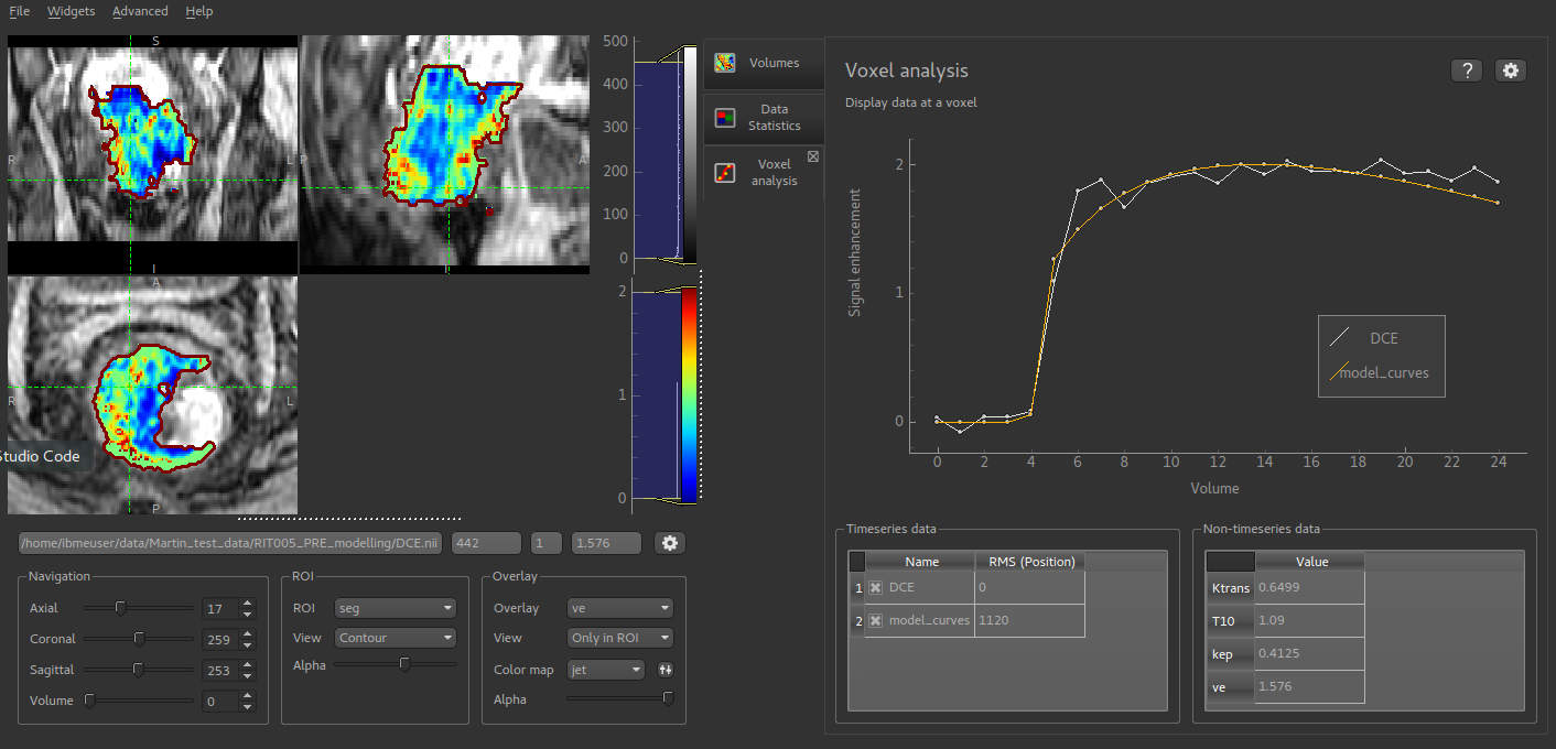
One use of this widget is comparing the output of a modelling process with the input data. In this screenshot the output of a DCE PK modelling process is overlaid on the original data curve so the degree of fit can be assessed. The parameter outputs from this modelling process are 3D data sets so the value of these parameters (Ktrans, kep, etc) can be viewed on the non-timeseries data tab.
The options button allows the behaviour of the plot to be changed:
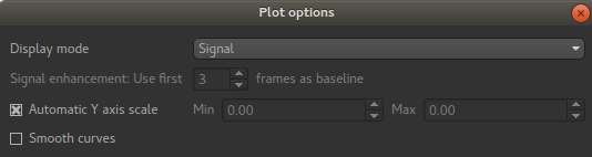
You can choose to plot either the raw data or to transform the timeseries data to signal enhancement curves. This uses the selected number of volumes as ‘baseline’ and scales the remainder of the data such that the mean value of the baseline volumes is 1. The data is then plotted with 1 subtracted so the baseline has value 0 and a data value of 1 means a signal enhancement of 1, i.e. a doubling of the baseline signal.
Note that if you modify the X or Y axes range on the plot (e.g. by right click and drag), the ‘Automatic Y-axis’ option is disabled - it must be re-enabled from the options button if you want to return to matching the plot range to the data.