QuantiCEST Tutorial
Introduction
This example aims to provide an overview of Bayesian model-based analysis for CEST [1] using the QuantiCEST widget [2] available as part of Quantiphyse [3]. Here, we work with a clinical Glioblastoma Multiforme (brain tumour) dataset acquired as part of the IMAGO clinical trial [4] using continuous wave CEST, however the following analysis pipeline should be applicable to both pulsed and continuous wave sequences acquired over a full Z-spectrum.
Basic Orientation
Before we do any data modelling, this is a quick orientation guide to Quantiphyse if you’ve not used it before. You can skip this section if you already know how the program works.
Start the program by typing quantiphyse at a command prompt, or clicking on the Quantiphyse
icon ![]() in the menu or dock.
in the menu or dock.
Loading some CEST Data
If you are taking part in an organized practical workshop, the data required may be available in your home
directory, in the course_data/cest/Clinical folder. If not, you will have been given instructions
on how to obtain the data from the course organizers.
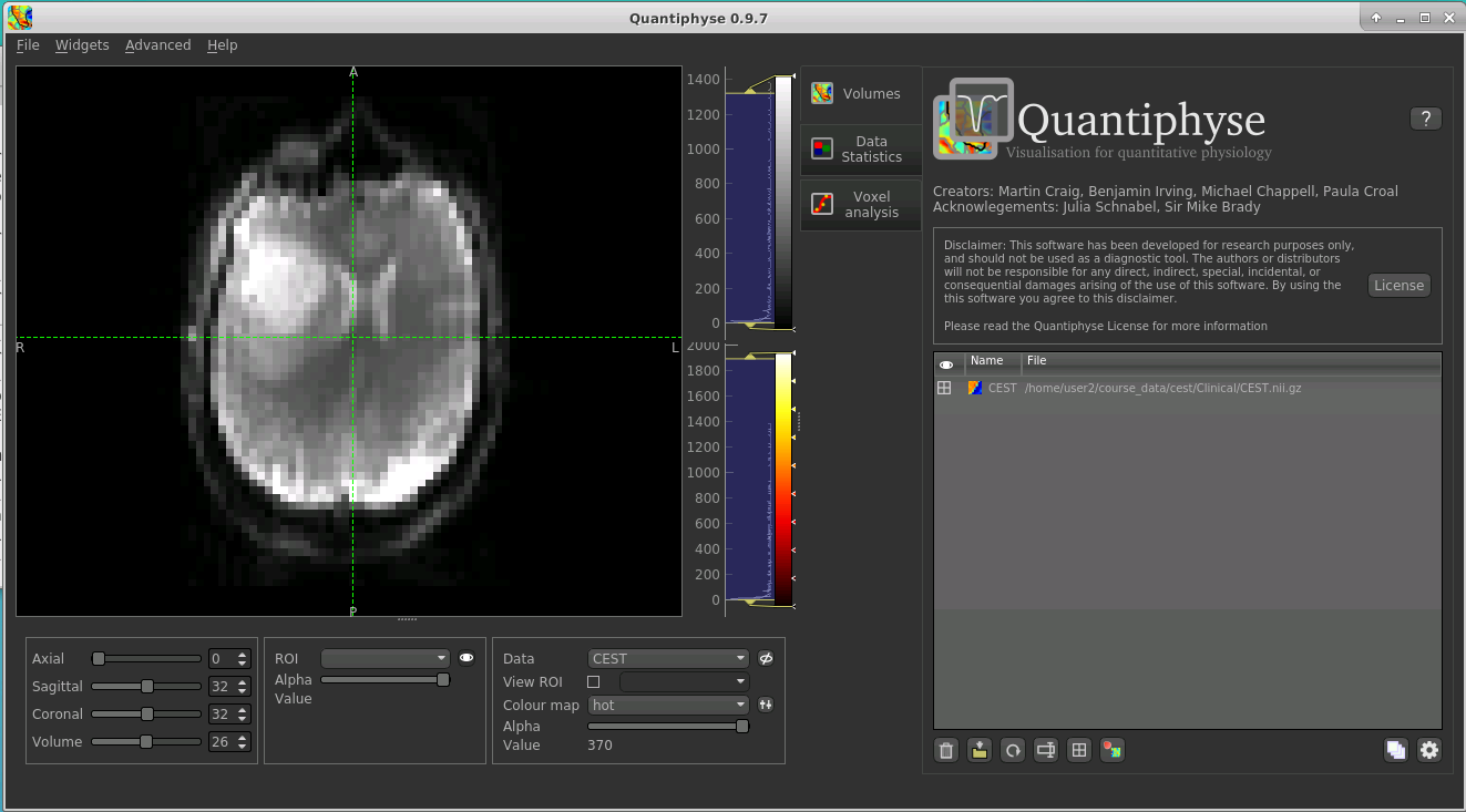
You will need to load the following data file:
CEST.nii.gz
Files can be loaded in NIFTI or DICOM format either by dragging and dropping in to the view pane, or by clicking
File -> Load Data. When loading a file you should indicate if it is data or an ROI by clicking the
appropriate button when the load dialog appears.
The data should appear in the viewing window.
Note
This data is single slice and there is shown in a single 2D window. Sometimes single-slice timeseries data
is (incorrectly) represented as a 3D NIFTI file, and would be displayed as such by quantiphyse. This should not be
the case here, however if it occurs with other data files the problem can be corrected by selecting Advanced Options
when loading data and choosing Treat as 2D multi-volume.
Image view
The left part of the window normally contains three orthogonal views of your data. In this case the data is a 2D slice so Quantiphyse has maximised the relevant viewing window. If you double click on the view it returns to the standard of three orthogonal views - this can be used with 3D data to look at just one of the slice windows at a time.
- Left mouse click to select a point of focus using the crosshairs
- Left mouse click and drag to pan the view
- Right mouse click and drag to zoom
- Mouse wheel to move through the slices
- Double click to ‘maximise’ a view, or to return to the triple view from the maximised view.
Widgets
The right hand side of the window contains ‘widgets’ - tools for analysing and processing data. Three are visible at startup:
Volumesprovides an overview of the data sets you have loadedData statisticsdisplays summary statistics for data setVoxel analysisdisplays timeseries and overlay data at the point of focus
Select a widget by clicking on its tab, just to the right of the image viewer.
More widgets can be found in the Widgets menu at the top of the window. The tutorial
will tell you when you need to open a new widget.
For a slightly more detailed introduction, see the Getting Started section of the User Guide.
Pre-processing
Brain Extraction
For clinical data, we recommend brain extraction is performed as a preliminary step using FSL’s BET tool [5], with the
–m option set to create a binary mask. You can also do this from within Quantiphyse using the FSL integration
plugin. It is strongly recommended to include a brain ROI as this will decrease processing time considerably.
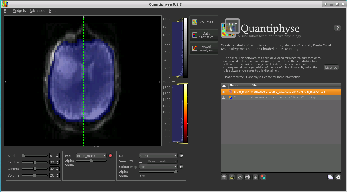
For ease, we have prepared the brain mask in advance in the following file:
Brain_mask.nii.gz
Load this data set via the File menu (or drag/drop), and his time select ROI as the data type. Once loaded, it will show up in the ROI
dropdown under the viewing pane, and will also be visible as a blue shaded region on the CEST data:
When viewing the output of modelling, it may be clearer if the ROI is displayed as an outline rather than a shaded
region. To do this, click on the icon ![]() to the right of the ROI selector (below the image view):
to the right of the ROI selector (below the image view):
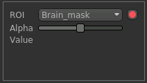
The icon cycles between display modes for the ROI: shaded (with variable transparency selected by the slider below), shaded and outlined, just outlined, or no display at all.
Note
If you accidentally load an ROI data set as Data, you can set it to be an ROI using the Volumes widget
(visible by default). Just click on the data set in the list and click the Toggle ROI button below the
data set list.
Motion Correction
Motion correction can be implemented using FSL’s MCFLIRT tool within Quantiphyse, or beforehand using FSL. To run
within Quantiphyse, select Widgets -> Registration -> Registration.
To run motion correction on the data, you need to:
- Set the registration mode to
Motion Correction- Ensure the method is set to
FLIRT/MCFLIRT- Select
CESTas theMoving data- Select the reference volume as
Specified volume.- For CEST data, you probably want the motion correction reference to be an unsaturated image, so we have set
Index of reference volumeto 0 to select the first image in the CEST sequence.- Set the output name to
CEST_moco
The resulting setup should look like this:
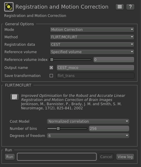
Click Run to run the motion correction. The output in this case is not much different to the input as there
was not much motion in this data, however if you switch between CEST and CEST_moco in the Overlay
selector (below the image view) you may be able to see slight differences.
Visualising Data
Select the Voxel Analysis widget which is visible by default to the right of the viewing window. By
clicking on different voxels in the image the Z-spectra can be displayed:
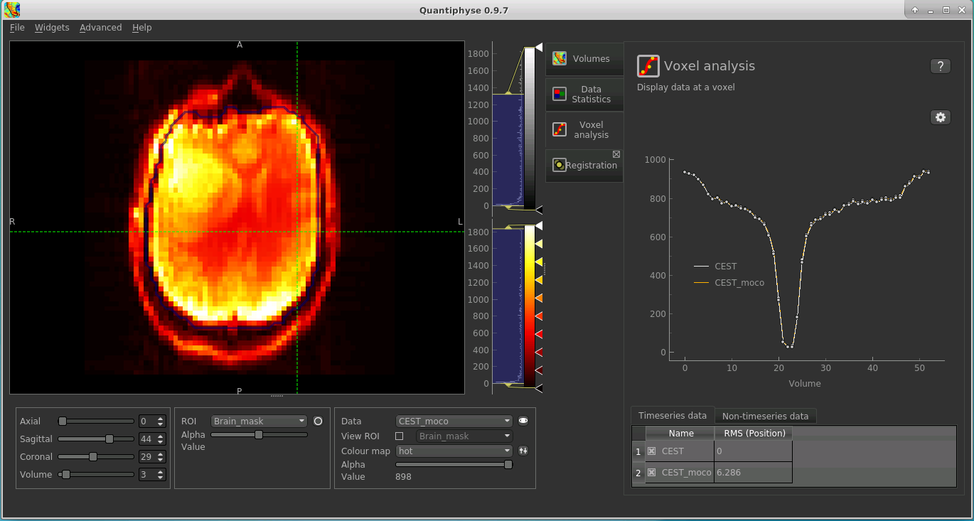
Note that the original and motion corrected timeseries are shown - they should be quite similar. You can turn individual timeseries datasets on and off by clicking the checkboxes below the signal plot.
Bayesian Model-based Analysis
To do CEST model analysis, select the QuantiCEST tool from the menu: Widgets -> CEST -> QuantiCEST. The widget
should look something like this:
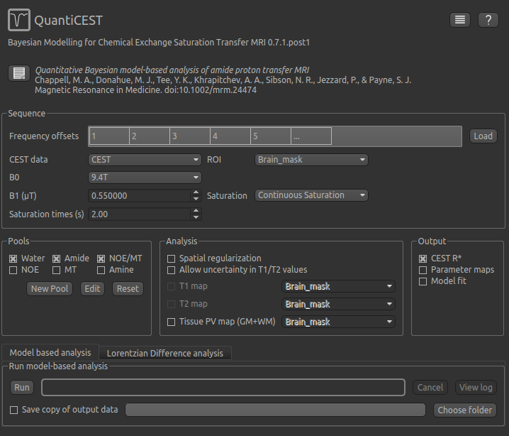
Data and sequence section
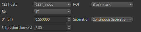
To begin with, make sure the CEST data set (or the CEST_moco data if you did motion correction)
is selected as the CEST data, and the Brain_mask ROI is selected as the ROI.
The B0 field strength can be selected as 3T for clinical and 9.4T for preclinical studies. This selection
varies the pool defaults. If you choose Custom as the field strength as well as specifying
the value you will need to adjust the pool defaults (see below).
In this case, only B0 needs altering to 3T, however in general you will need to specify the B1 field strength, saturation method and saturation time for your specific experimental setup.
Next we will specify the frequency offsets of your acquisition - this is a set of frequences whose length
must match the number of volumes in the CEST data. You can enter them manually, or if they are stored in
a text file (e.g. with one value per row) you can click the Load button and choose the file.
For this tutorial we have provided the frequency offsets in the
file Frequency_offsets.txt, so click Load, select this file and verify that the values are as follows:

Pool specification
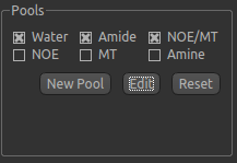
In general, a minimum of three pools should be included in model-based analysis. We provide some of the most common
pools to include, along with literature values for frequency offset, exchange rate, and T1 and T2 values for the
field strengths of 3T and 9.4T. The data for the pools we have selected can be displayed by clicking the Edit
button:
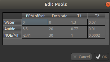
You can also use this dialog box to change the values, for example if you are using a custom field strength. The
New Pool button can also be used if you want to use a pool that isn’t one of the ones provided.
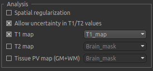
Analysis section
In the analysis section we have the option of allowing the T1/T2 values to vary. We will enable this, but provide T1 and T2 maps to guide the modelling. This is stored in the following file:
T1map.nii
Load the T1 map into Quantiphyse using File->Load Data or drag/drop as before. Now select the T1 map checkbox
and choose the appropriate data set from the dropdown menu. The result should look like this:
Output section
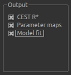
By default, CESTR* maps will be output, with the added option to output individual parameter maps, as well as fitted curves. As shown above, we have set both of these options, so that fitted data can be properly interrogated.
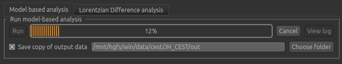
Running model-based analysis
The Run button is used to start the analysis. The output data will be loaded into Quantiphyse but if you would
also like to save it in a file, you can select the Save copy of output data checkbox and choose a folder
to save it in.
Visualising Processed Data
If you re-select the Voxel analysis widget which we used at the start to look at the CEST signal in the
input data, you can see the model prediction overlaid onto the data. By clicking on different voxels you
can get an idea of how well the model has fitted your data.
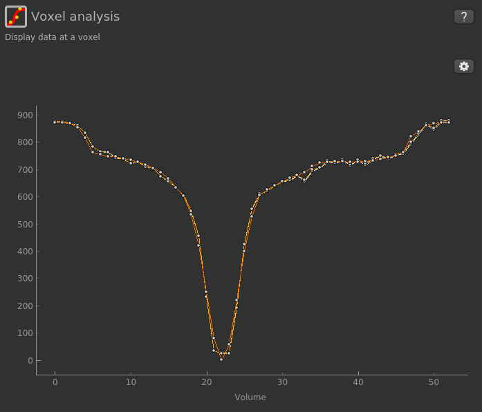
For each non-water pool included in the model there will be a corresponding CESTR* map output (here amide and a macromolecular pool), and these values will be summarised for each voxel underneath the timeseries data.
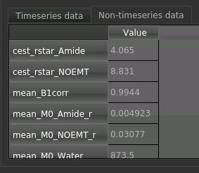
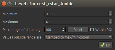
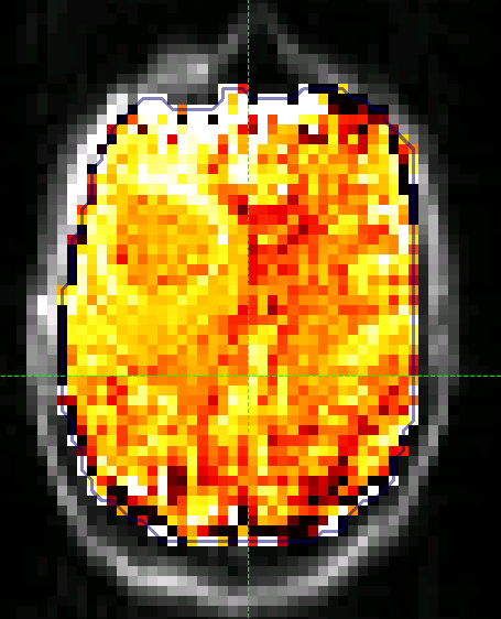
Here we are most interested in the behaviour of the Amide pool: cest_rstar_Amide. In this clinical example,
there is a relatively large tumour on the right hand side of the brain. If we select cest_rstar_Amide from
the overlay selector (below the viewing window), an increase in CESTR* is evident around the outer edge of
the tumour. To see this clearly, we can set the color map range to between 0 and 4.5 using the
‘levels’  button from the overlay selector below the viewer:
The CESTR* map should then appear as folows:
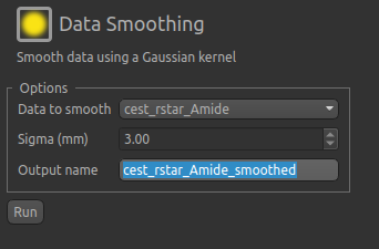
We can extract quantitative metrics for this using regions of interest (ROIs). Before doing this it can
help to apply some smoothing to the data. From the menu select Widgets->Processing->Smoothing and set
the options to smooth cest_rstar_Amide with a smoothing kernel size of 3mm:
The output of this smoothing appears as follows (again with the color map set to between 0 and 4.5 as before):
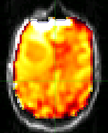
The tumour is more visible in this section (to the left of the image, i.e. the right side of the brain).
Extracting quantitative Metrics
We have prepared a series of ROIs for the tumour region in the files:
WholeTumour_ROI.nii.gzTumourRim_ROI.ni.gzTumourCore_ROI.nii.gz
Load these files using File->Load Data or drag/drop, selecting as ROIs.
Now open the Data Statistics widget which is visible by default above the Voxel Analysis widget. We
can now select statistics on cest_rstar_Amide within this ROI (click on Summary statistics to view):
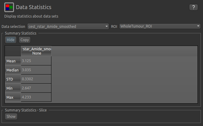
Note that it is possible to display statistics from more than one data set, however here we are just going to look at the CESTR* for the Amide pool.
To compare with the non-ischemic portion, we will now draw a contralateral ROI. To do this, open the
Widgets->ROIs->ROI Builder and select the WholeTumour_ROI ROI for editing:
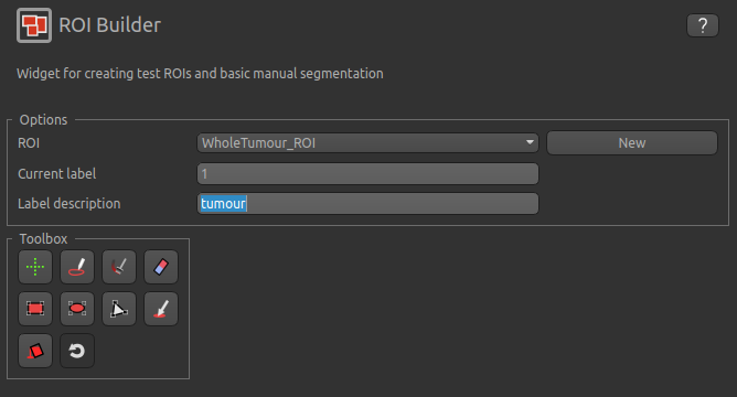
The default label of 1 has been used to label the tumour, so type tumour in the Label description box.
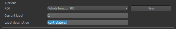
Now enter a new label number (e.g. 2) and change the default name from Region 2 to contralateral:
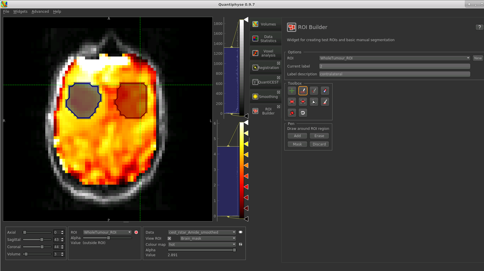
To manually draw a contralateral ROI, use either the pen tool  to draw freehand around a region on the opposite
side of the brain, or use one of the other tools to select a suitable region - for example you could draw it
as an ellipse using the
to draw freehand around a region on the opposite
side of the brain, or use one of the other tools to select a suitable region - for example you could draw it
as an ellipse using the  tool. After drawing a region, click
 Add to add it to the ROI. It should appear
in a different colour as it is a different label. Here is an example (the new contralateral region is red):
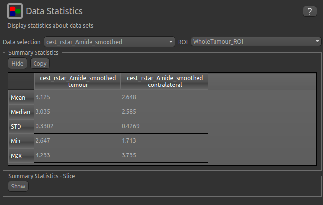
Now go back to the Data Statistics widget where we can compare the CESTR* in the two regions we have defined.
As expected, CESTR* of the amide pool is higher for the tumour tissue than for healthy tissue.
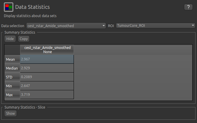
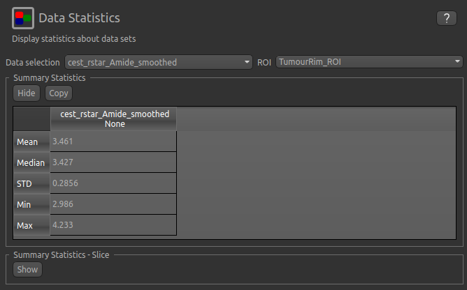
We can then interrogate the changes within the tumour further, by looking at the Summary Statistics in the
TumourRim_ROI and TumourCore_ROI ROIS. Below you will see that while CESTR* is even more elevated in
comparison to the contralateral tissue in the whole tumour ROI, the tumour core is more comparable to
contralateral tissue.
Beyond CESTR*
The minimum outputs from running model-based analysis are the model-fitted z-spectra, and CESTR* maps for non-water pools, as defined in your model setup. If the Parameter Maps option is highlighted then for each pool, including water, there will be additional maps of proton concentration and exchange rate (from which CESTR* is calculated), as well as frequency offset (ppm). For water, the offset map represents the correction for any field inhomogeneities.
If the Allow uncertainty in T1/T2 values is set then fitted maps of T1 and T2 will be available for each pool.
Naming conventions follow the order the pools are defined in the QuantiCEST setup panel.
Viewing data without the water baseline
Rather than doing a full model-based analysis as described in section Bayesian model-based analysis, QuantiCEST also
has the option to simply remove the water baseline from the raw data, allowing you to directly view or quantify the
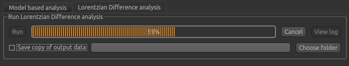
smaller non-water peaks in the acquired CEST volume. Baseline removal is done using the Lorentzian Difference
Analysis (LDA) option in QuantiCEST - this is available by selecting the alternative tab in the box containing
the Run button.
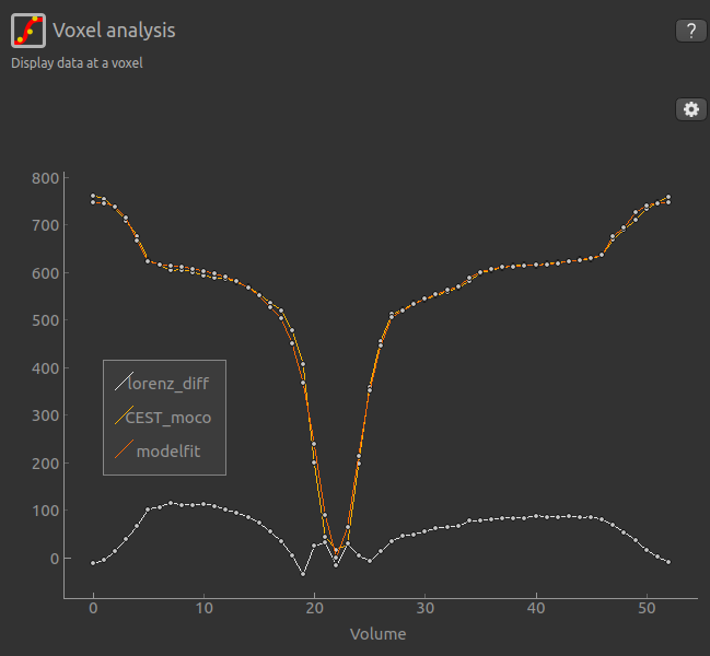
LDA works by fitting a subset of the raw CEST data (within ±1ppm, and beyond ±30ppm) to a water pool,
and then subtracting this model fit from the data. This leaves behind the smaller non-water
peaks in the data, called a Lorentzian Difference spectrum. QuantiCEST outputs this as lorenz_diff.nii.gz.
This can be viewed in the Voxel Analysis widget alongside the data signal and the model-based fit:
Running QuantiCEST from the command line
Here we have covered basic model-based analysis of CEST data using the interactive GUI. If you have multiple data sets it may be desirable to automate this analysis so that the same processing steps can be run on several data sets from the command line, without interactive use.
Although this is beyond the scope of this tutorial, it can be set up relatively simply. The batch processing options
for the analysis you have set up can be displayed by clicing on the following button at the top of the QuantiCEST
widget  . For more information see documentation for Batch processing.
References
| [1] | Chappell et al., Quantitative Bayesian model‐based analysis of amide proton transfer MRI, Magnetic Resonance in Medicine, 70(2), (2013). |
| [2] | Croal et al., QuantiCEST: Bayesian model-based analysis of CEST MRI. 27th Annual Meeting of International Society for Magnetic Resonance in Medicine, #2851 (2018). |
| [3] | www.quantiphyse.org |
| [4] | P.L. Croal et al., Quantification of regional pathophysiology in Glioblastoma Multiforme27th Annual Meeting of International Society for Magnetic Resonance in Medicine #897 (2019). |
| [5] | S.M. Smith. Fast robust automated brain extraction. Human Brain Mapping, 17(3):143-155, 2002. |