Compare data
Widgets -> Visualisation -> Compare Data
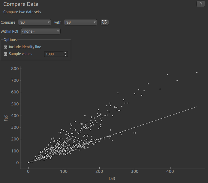
This widget shows a comparison between two data sets. Select the two data sets you are interested in from the menus and
click Go to display a scatter plot of corresponding voxel values.
Options
ROI
This option restricts the comparison to voxels within a specified ROI. You should use this option if the data of interest does indeed lie within an ROI, otherwise the sample of points compared will include many irrelevant ‘outside ROI’ voxels and therefore the comparison will be less reliable.
Sample points
By default only a random sample of 1000 points is displayed. This is because the scatter plot can take a long time to generate otherwise. You can choose the number of points in the sample. If you want to use all values in comparison, turn off the sample, but be aware that the plot may take some time to generate, particularly for large or 4D data sets.
Show identity line
A dotted identity line can be shown in cases where you want to compare the data for equality. In the example above while there is some degree of linear relationship between the data, it is not perfect and the trend does not match the identity line.
Heat map (experimental)
This changes to scatter plot to a heat map. This tool is experimental and you may need to tweak the graph colour map to get a good result. The advantage of a heat map over a scatter plot is that when many points lie very close to each other it can be difficult to tell how much greater the point density is from a scatter plot.
For example, if you are comparing two data sets for equality it may look like there are a large number of inconsistent voxels far away from the identity line. However in practice these may actually be a very small proportion of the total voxels but appear more prominent in a scatter plot because they are not close to other points. Switching to a heat map may show that in fact the vast majority of the data is along the identity line.